FairShare: Rethinking Shared Finance Through Social Design
Mixed-Method UX Research
Wireframing
Prototyping
0→1 Design
Overview
FairShare is a social-fintech app that makes sharing money with friends simple, fair, and fun. It reimagines group expense management by blending Splitwise-style functionality with social and gamified interactions. Users can automatically split bills, save collectively for shared goals, send friendly reminders, and celebrate milestones — all while maintaining transparency and harmony in their relationships.

My Role
Primary Designer/Researcher
Team
-
Timeline
8-10 Weeks
Tools Used
Figma/Miro
Notion/Google Docs
Lookback
Relume.io/v0
The Problem
The Problem
Splitting money among friends sounds simple.
In reality, it’s anything but.
People regularly share expenses for:
Trips
Rent and utilities
Group dinners
Gifts and celebrations
Yet money introduces tension:
Asking someone to pay feels awkward
Reminders feel confrontational
Transparency can feel like oversharing
Existing apps feel cold, transactional, or invasive
Most tools solve the math.
Very few solve the social friction.
Why This Problem Matters
Research and industry patterns show that:
Money is one of the most emotionally charged topics in friendships
Users often avoid follow-ups to “keep the peace”
Public financial feeds increase discomfort rather than trust
People rely on multiple apps to manage one shared experience
Despite the popularity of finance apps, no tool meaningfully supports the emotional side of shared money.
Design Goal
How might we help people manage shared expenses and group financial goals in a way that feels transparent, motivating, and socially safe—without damaging relationships?
Understanding the User & Early Assumptions (Why They Were Wrong)
Primary Persona: Emma
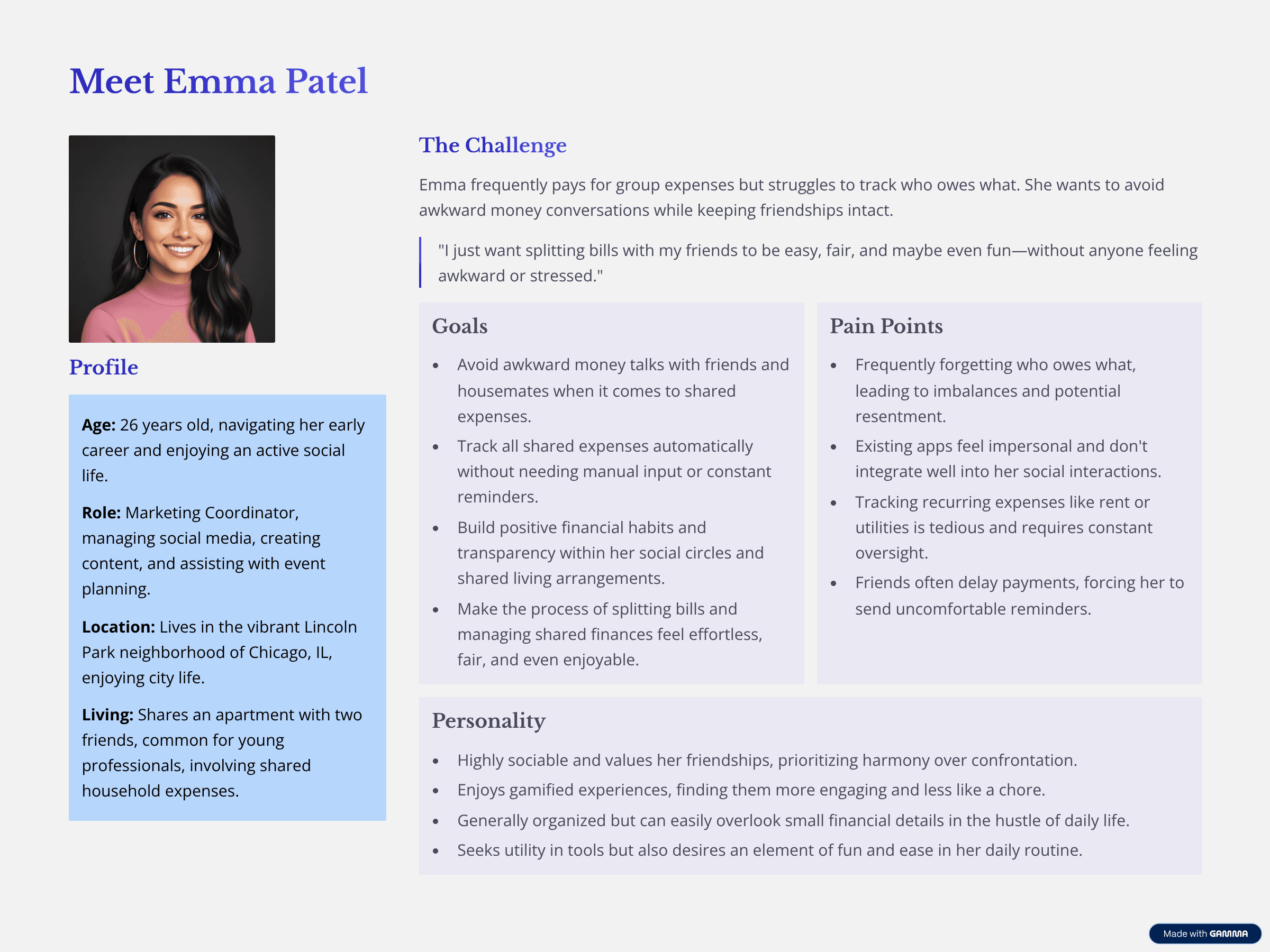
Initially, I assumed:
Automatic activity updates would be helpful
Transparency meant visibility by default
Social feeds would naturally increase engagement
User research quickly challenged these assumptions.
Research & Discovery
Method 1: Competitive Analysis
Apps Reviewed:
Splitwise
Tricount
SettleUp
Venmo
PayPal
CashApp
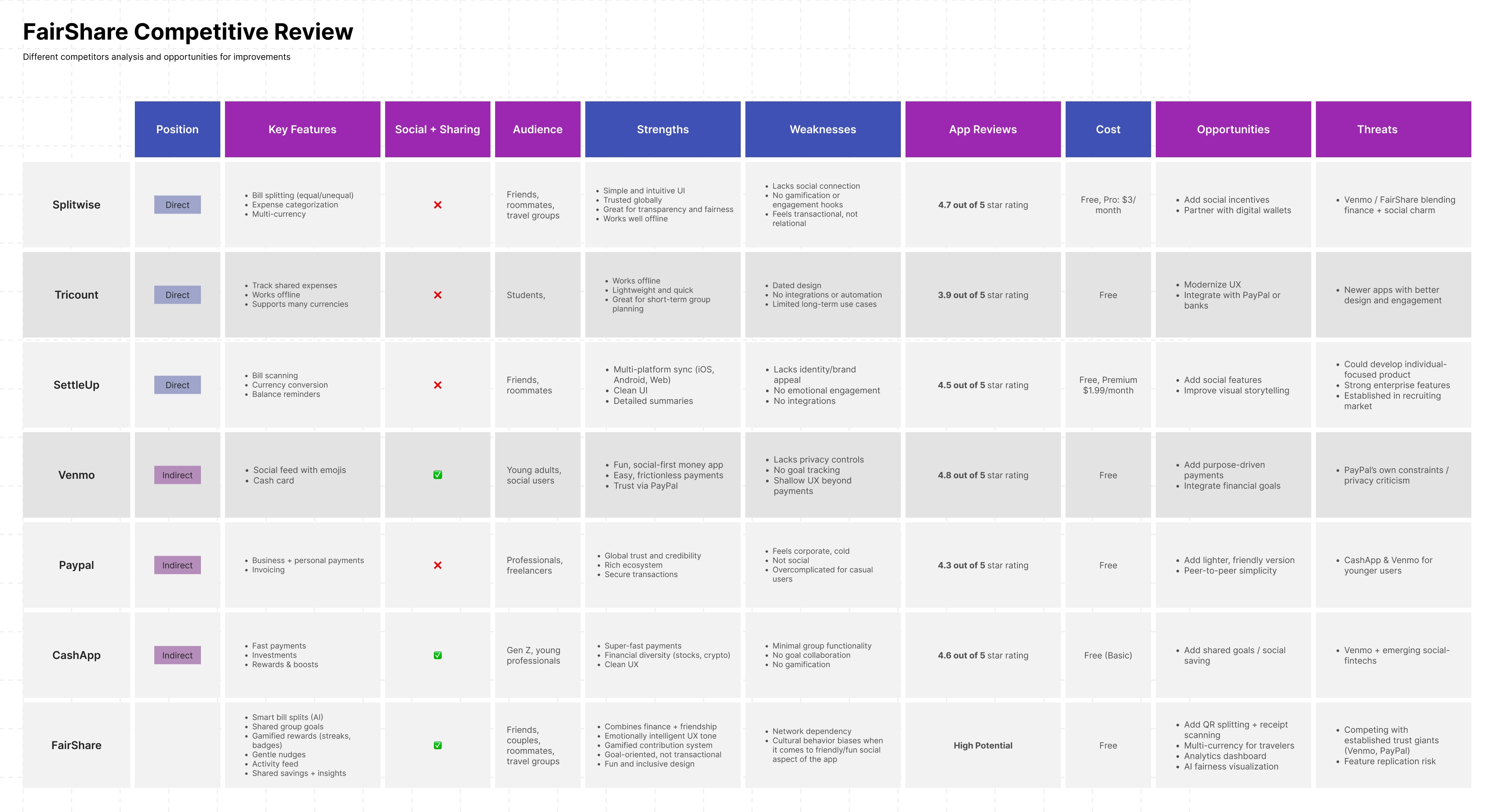
What I Studied:
Expense splitting flows
Privacy models
Social features
Motivation mechanics
Key Findings
Apps focus on either finance or social, rarely both
Public-by-default feeds cause discomfort
No app allows users to manually curate financial updates
Gamification and goal motivation are largely absent
Opportunity Identified:
Design a social-finance experience where users control visibility, and progress feels shared—not exposed.
Method 2: Design Review & User Testing
Participants: 4 users with UX familiarity and real experience using finance apps
Goals:
Evaluate the interpretation of social-finance features
Test navigation and core tasks
Understand comfort around sharing financial activity
Tasks Tested:
Create a shared goal
Add a contribution
Split a bill
Interpret the activity feed
Adjust privacy settings
Scenarios Used:
Saving for a “Trip to Japan”
Splitting a group dinner bill
What Users Told Me (Directly)
“I don’t want the app announcing what I did.”
“The feed feels generic—where’s the personalization?”
“I’m hesitant to share financial activity publicly.”
“I’m not sure what happens after I contribute.”
These comments reshaped the entire product direction.
Low-Fidelity Exploration
I began with rough sketches focused on:
Dashboard-first navigation
Quick bill scanning
Shared goal visibility
Automatic activity feed
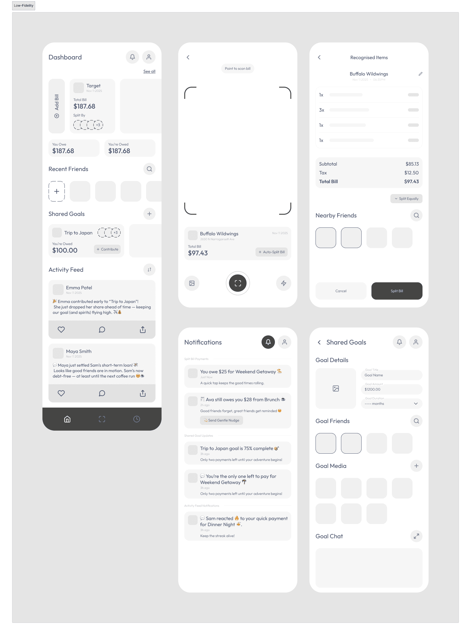
Early Structure:
Dashboard
History
Scan Bill
Chat
What Didn’t Work
Automatic feed posts felt invasive
Goal creation and chat felt blended
Contribution outcomes weren’t clear
Privacy controls were missing
Design Iteration: From Lo-Fi to Hi-Fi
User feedback led to major structural changes.
Key Improvements
1. Manual Activity Creation
Instead of auto-generated posts, users now:
Choose when to share
Write their own updates
Control visibility per post
This restored a sense of ownership and trust.
2. Privacy as a First-Class Feature
Every action includes:
Audience selection
Private / group-only / visible options
Privacy moved from a setting to a design principle.
3. Milestone Gamification
Users wanted motivation—not pressure.
Added:
Contribution badges
Group milestones
Progress celebrations
These reinforced teamwork without competition.
4. Clear Separation of Spaces
Goal creation
Goal overview
Group chat
Each now serves a distinct mental model, reducing confusion.
High Fidelity Screens
The Final Experience
Core Features
Smart bill splitting
Shared financial goals
Manual social updates
Privacy-first activity feed
Milestone-based motivation
The experience feels:
Supportive
Transparent
Social—but never invasive
Why This Works
FairShare doesn’t just track money.
It protects relationships.
By respecting emotional boundaries, offering control, and celebrating progress collaboratively, FairShare reframes finance as a shared experience—not a source of tension.

