JobSync: Designing an AI-Powered, Privacy-First Job Search Experience
Mixed-Method UX Research
Wireframing
Prototyping
0→1 Design
Overview
JobSync is a conceptual browser extension and dashboard designed to help job seekers manage their applications, follow-ups, and insights in one focused, privacy-conscious space. The project explored how thoughtful UX, supported by AI, can reduce cognitive load during the job search without overwhelming users or compromising trust.
This case study documents a 0→1 design process, from early assumptions and user research to iterative prototyping, usability testing, and refinement. The goal was not to introduce more automation, but to design clarity into a complex, emotionally charged workflow.

TL;DR — 60 second version
At a Glance
Job searching is stressful. We made it less chaotic.
Task success rates increased from 57% to 100%
Onboarding time reduced from 3:35 to 2:39
Task error rate dropped from 100% to 16%
NPS score by Round 2 (increased from 7.21)
My Role
Primary Designer & Supporting Researcher
Team
Chinedum Ekeh
Kalyani Auti
Ishrar Islam
Tanvi Bhakhar
Shaik Aziz
Timeline
Summer 2025 (8 Weeks)
Tools Used
Figma
Miro/FigJam
Lovable/Vercel V0
Google Forms
The Problem
Job seekers today rely on a patchwork of tools to manage their search.
This fragmentation increases cognitive load, causes missed opportunities, and amplifies stress during an already emotionally demanding process. Despite the rise of AI-powered tools, many job seekers still feel unsupported, confused, or hesitant to trust automation with sensitive personal data.
The modern job search is both operationally chaotic and emotionally taxing. What should feel like a structured journey becomes a reactive scramble, leading to cognitive fatigue and self-doubt.
5–7
Avg. tools used daily per job seeker
13
Total no. of Usability test participants
44
AI sentiment survey participants
11
User interviews + live observation sessions
2×
Rounds moderated usability testing
The Challenge
How Might We Statement
"How might we design a unified, AI-assisted system that restores clarity and control to the job search experience — surfacing the right insights at the right moment, without overwhelming users or asking them to trade their privacy for convenience?"
Specifically, how might we:
Help users see all applications and statuses at a glance without feeling overwhelmed
Reduce ambiguity around where each opportunity stands
Guide users with clear, timely next steps
Foster a sense of measurable progress and control
Integrate AI support without compromising trust or privacy
Visibility | Guidance | Trust |
|---|---|---|
Help users see all applications and statuses at a glance — without feeling overwhelmed by information density. | Guide users with clear, timely next steps — AI support without sacrificing autonomy or feeling surveilled. | Build an honest privacy model with opt-in AI features, transparent data policies, and easy controls. |
Our Initial Thinking; Research challenged all of them.
"Automation saves time and is therefore desirable." | "A feature-rich dashboard communicates value at a glance." | "Users will welcome AI-generated recommendations." |
All three turned out to be more complicated than we expected. Research told us where the nuance was.
The Research
We thought,
To design something meaningful, we needed to understand what people actually go through.
We ran 11 interviews, 2 observation sessions, and a survey with 44 participants. Our competitive review covered Teal, Huntr, Simplify, Crelate, and Dover. The verdict: the problem wasn't the job hunt itself — it was disorganization and emotional fatigue.
Competitive Analysis — First, we looked at what already existed.
The tools claiming to simplify the job search often added more clutter. The gap wasn't in features — it was in focus.
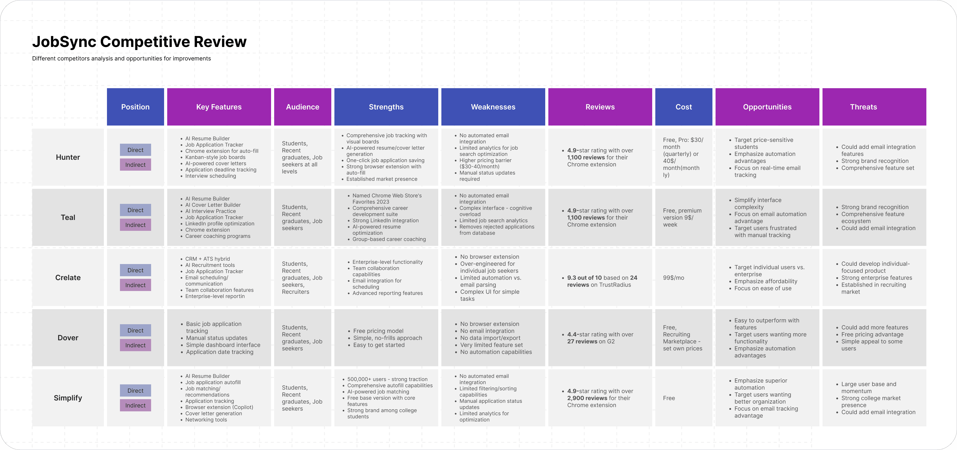
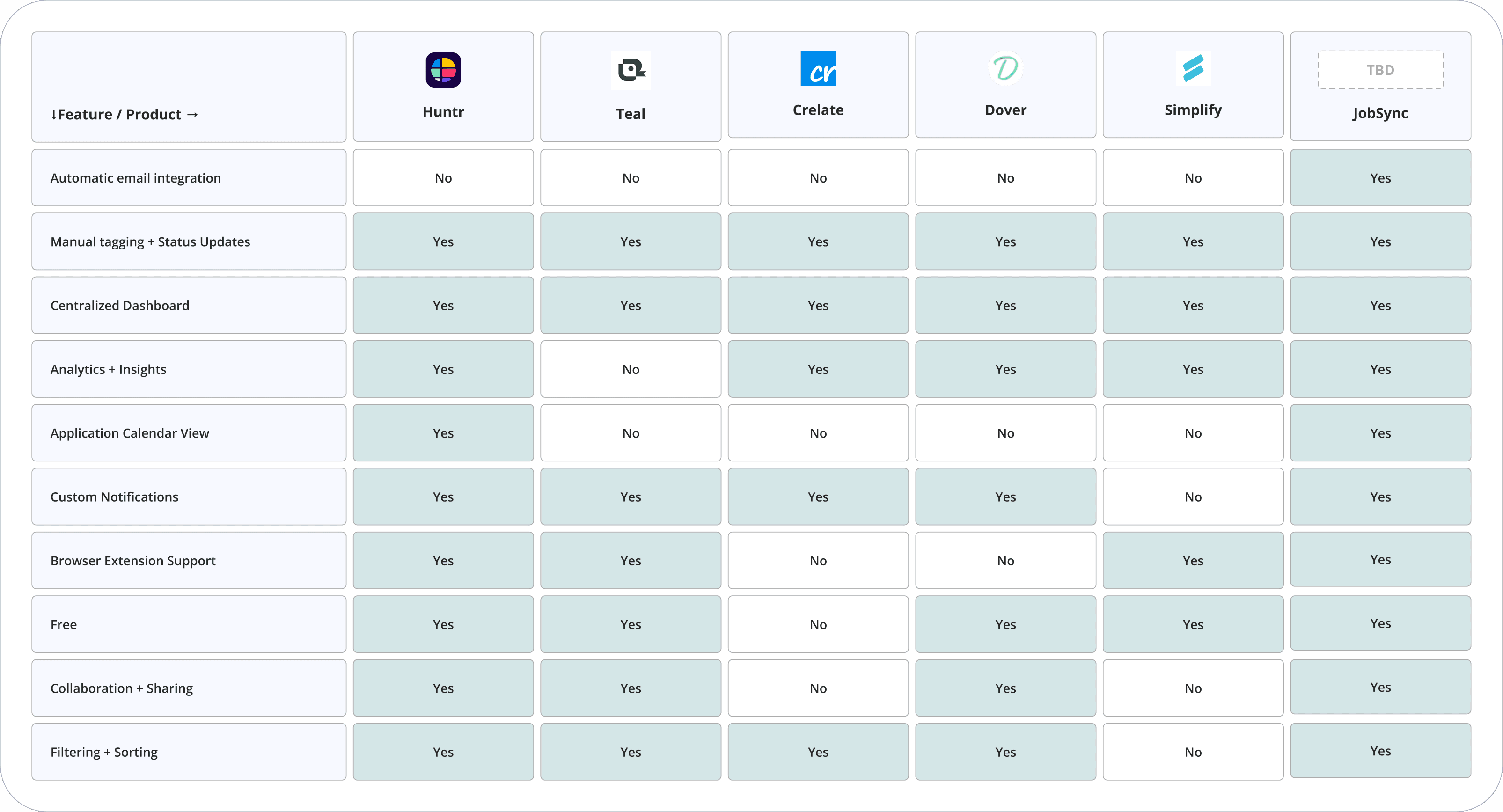
Huntr
Cluttered UI; heavy manual input required
Teal
No email integration; limited AI features
Simplify
Good autofill, but weak tracking and manual status updates
Crelate
Enterprise-focused; high cost; poor fit for individuals
Dover
Outbound-only; missing inbound tracking entirely
Then we talked to people — User Interviews & Affinity Diagram
11 participants, ages 24–38. 30–45 min sessions via Zoom combining interview with live screen observation. Quotes were synthesized into six clusters: Pain Points, Communication & Feedback, Current Tools, Tracking Challenges, Emotional Impact, and Desired Features.
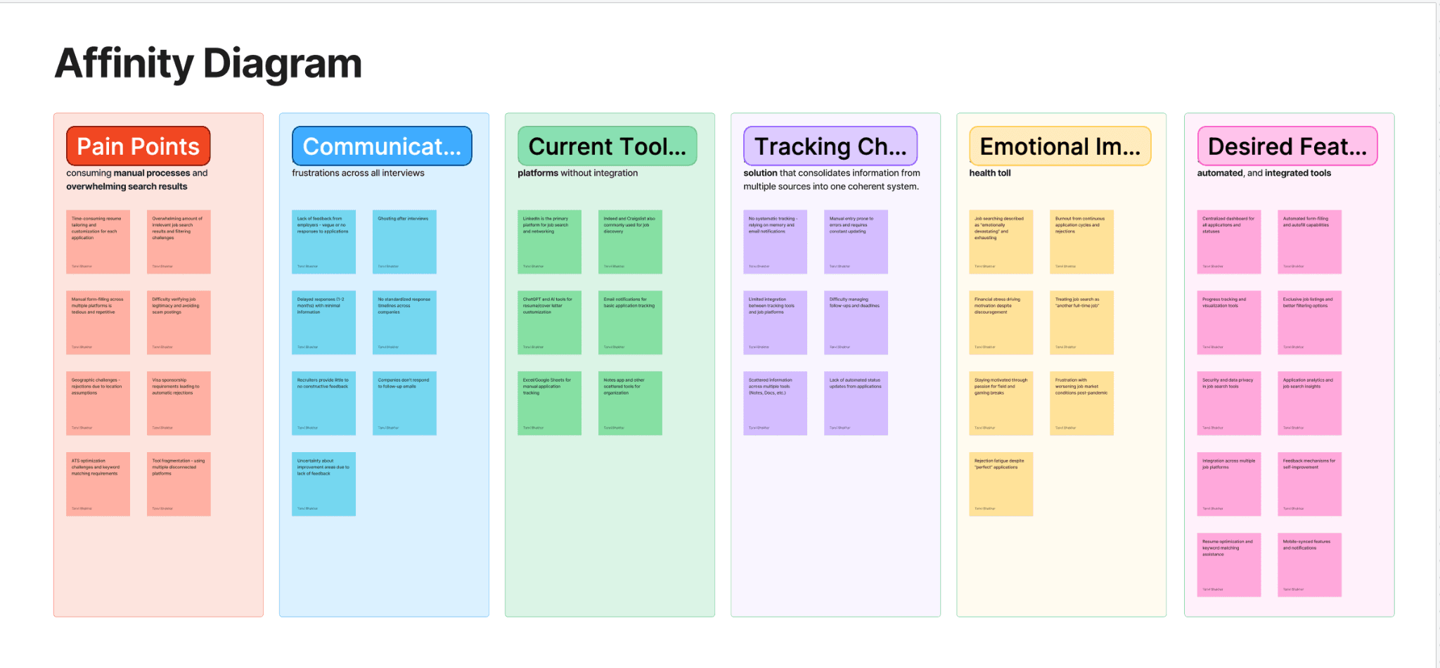
Tracking is the number-one pain point
Every participant had a system — none worked sustainably. Maintenance was more painful than the search itself.
Silence from employers creates anxiety, not neutrality
Not knowing why you were rejected is worse than a clear "no." This became a core design driver: give users insight, even when employers won't.
Users want AI for time-savings, not surveillance
Top desired: auto-tracking, resume tailoring, personalized recs. Top concern: privacy and data security — which directly shaped our opt-in AI model.
People will switch tools — if the value is immediate
Pattern: enthusiasm → abandonment due to friction. Reducing the cost of showing up mattered more than feature richness.
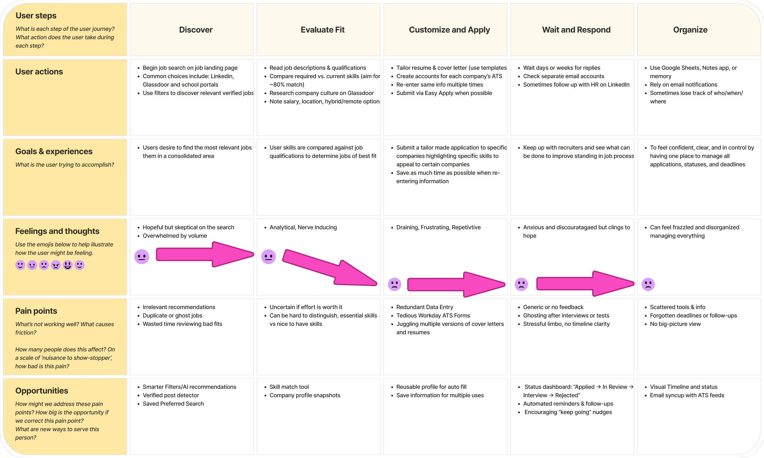
We developed a User Journey Map
Five stages: Discover → Evaluate Fit → Customize & Apply → Wait & Respond → Organize. Sentiment dropped sharply from "Customize & Apply" onwards — the emotional trough we designed most interventions around.
The Design Approach
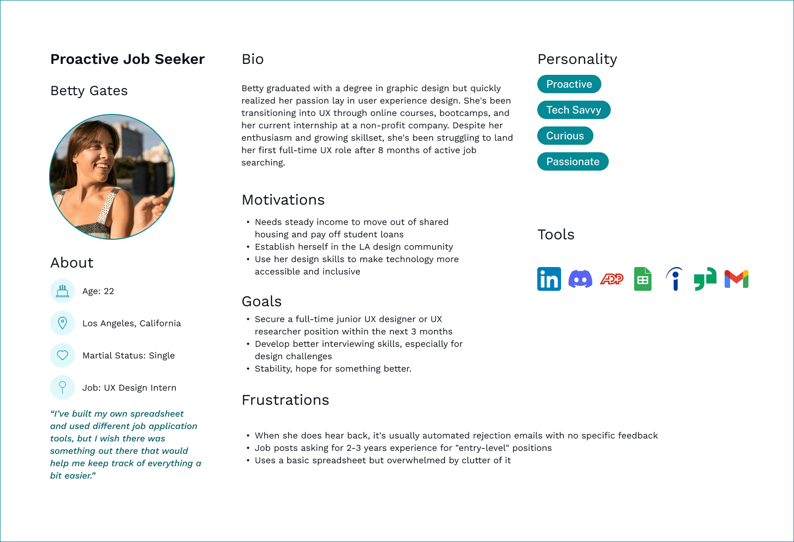
Betty Gates
Proactive Job Seeker · UX Designer · Age 22
Lorem ipsum dolor sit amet.
High-volume applicant
Tech-savvy
Craves actionable insights

Rafael Caba
Rusty Job Seeker · Marketing Analyst · Age 36
Lorem ipsum dolor sit amet.
Sporadic applicant
Easily overwhelmed
Needs passive tracking
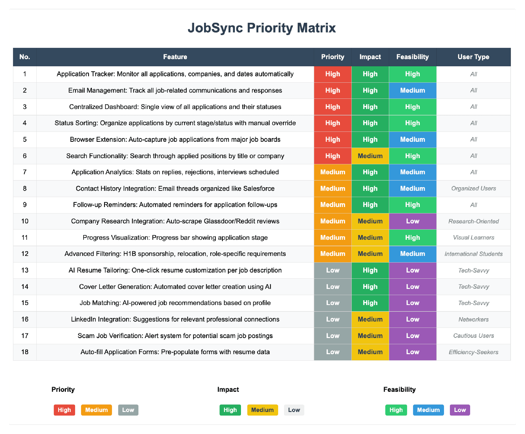
Feature Prioritization
18 potential features scored against priority, impact, and feasibility. The top four — Application Tracker, Centralized Dashboard, Status Sorting, Browser Extension Auto-Capture — all ranked High across every dimension. AI resume tailoring and job matching were deferred as low-feasibility for this iteration.
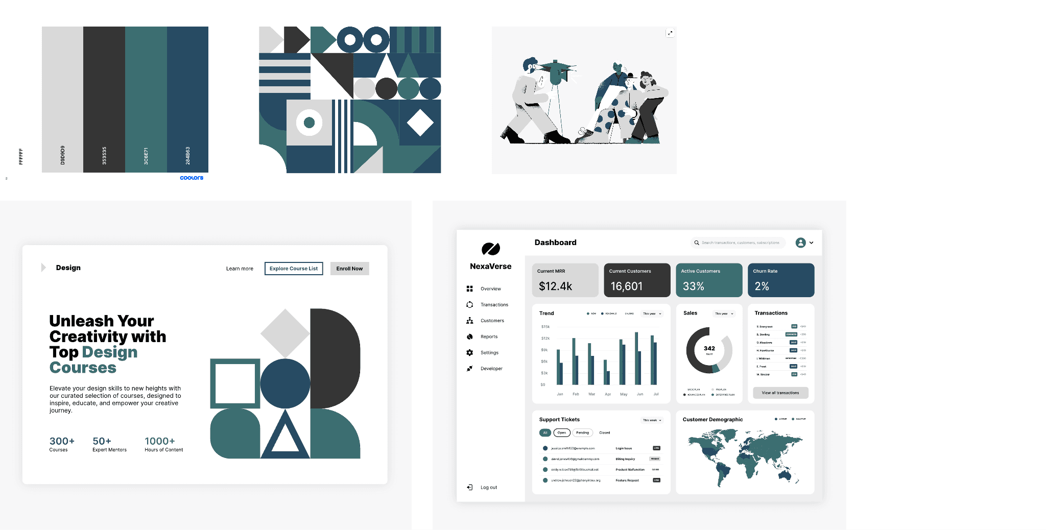
Brand Identity & Visual Direction
Before wireframing, the team explored logo concepts and established a color palette grounded in the product's values: clarity, trust, and calm efficiency. The final identity uses a teal/dark palette with clean typography — professional but approachable.
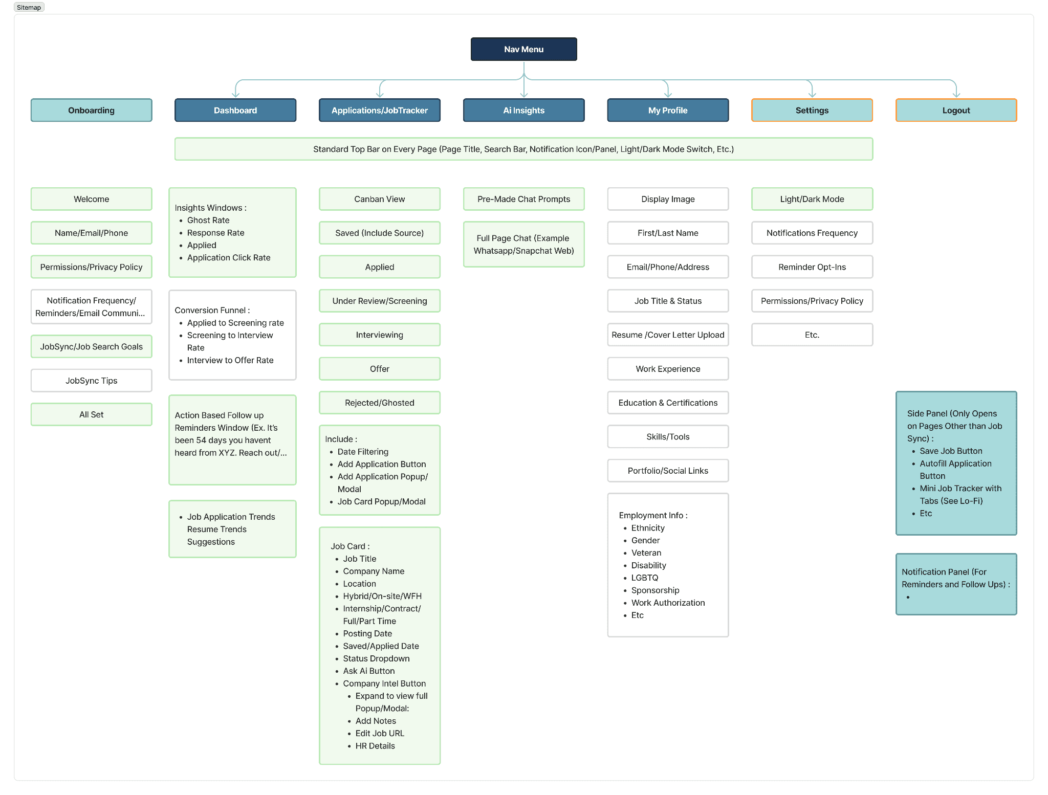
Information Architecture
Full sitemap before wireframing: Onboarding, Dashboard, Applications/Job Tracker (Kanban: Saved → Applied → Screening → Interviewing → Offer → Rejected), AI Insights, My Profile, Settings, and the browser extension side panel. Grayed-out nodes mark features intentionally descoped.
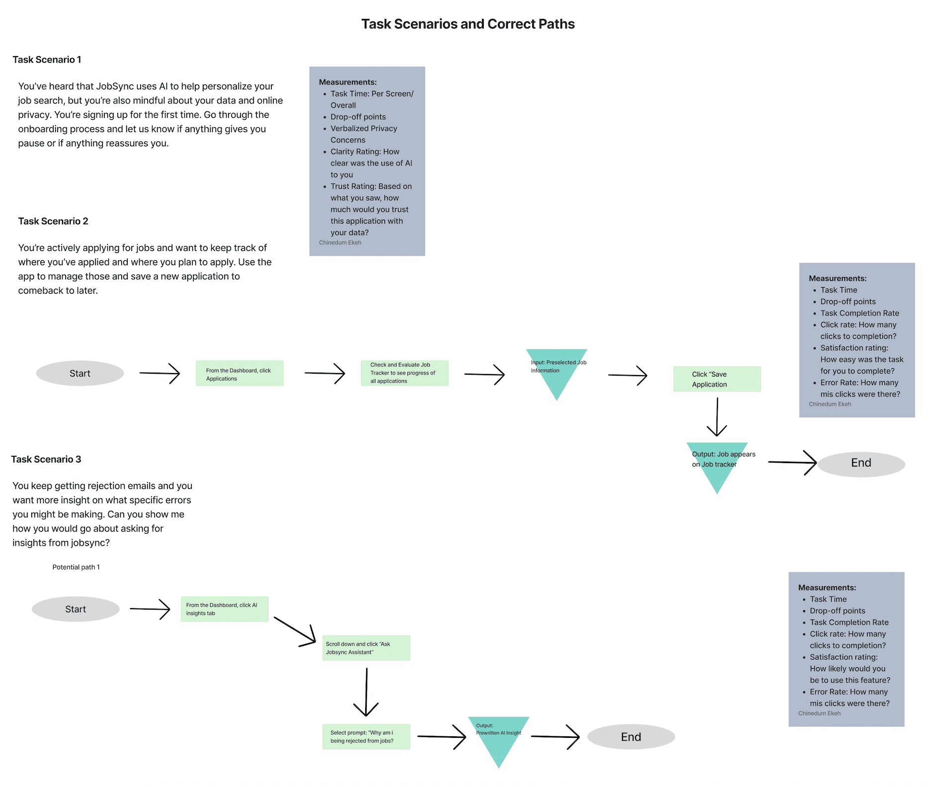
Task Flows
Three critical task scenarios with step-by-step happy paths and measurement criteria — defined before a single screen was designed, and became the backbone of both usability testing rounds.
The Solution
Low Fidelity Prototype — Interact below
The lo-fi prototype established task flows and navigation structure before any visual design. Click through to explore the onboarding, job saving, and status-checking flows.
JobSync is a browser extension + web dashboard working as one unified system. The extension captures jobs as you browse; the dashboard gives you the full picture — tracker, analytics, and AI-powered insights — in one place.
Onboarding
A streamlined 6-step flow with a persistent left-rail progress indicator. Privacy settings and AI consent are surfaced at the moment they're relevant — not buried upfront. After Round 1, we condensed to only essential steps and cut superfluous screens entirely.
Key Takeaways & What We Improved
Primary Measurable Impact
Application-tracking task success increased by 43 percentage points, from 57% to 100% after design iteration. Reducing friction doesn't just make tools more usable — it reduces stress and supports sustained engagement.
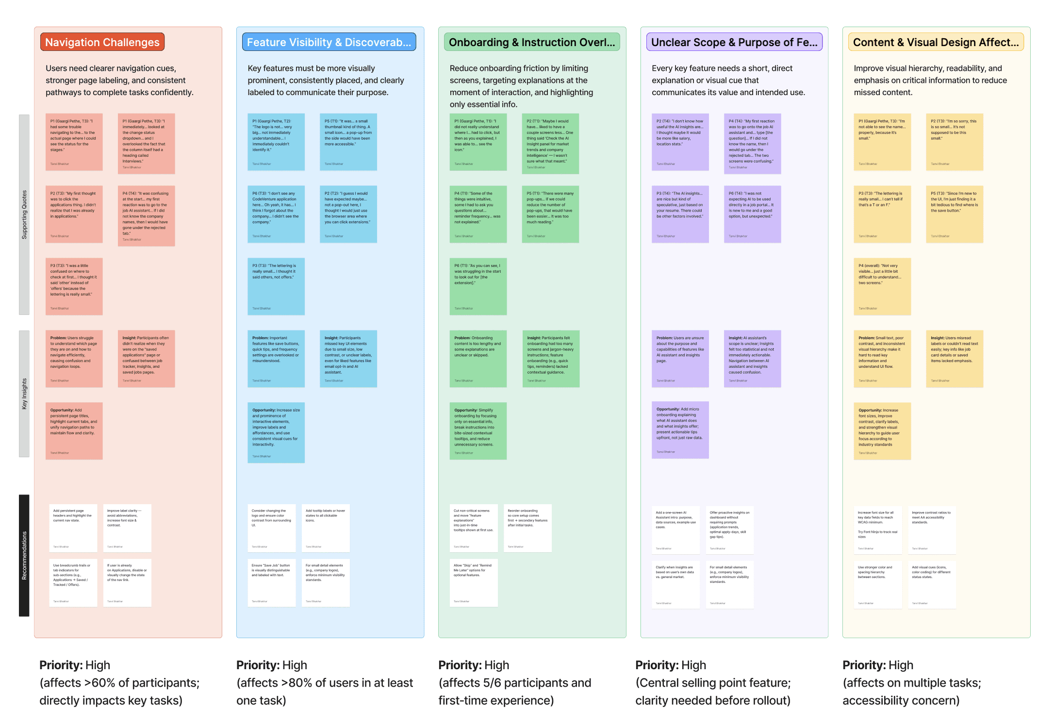
Round 1 — Synthesis
After Round 1 testing with 7 participants, we organized observations into an affinity diagram surfacing 5 high-priority problem clusters — each affecting the majority of participants, all marked Priority: High.
Round 1 — General Impressions
Participant feedback organized into what worked, what was mixed or conditional, and what raised concerns — giving us a clear signal on where to invest design iteration effort.
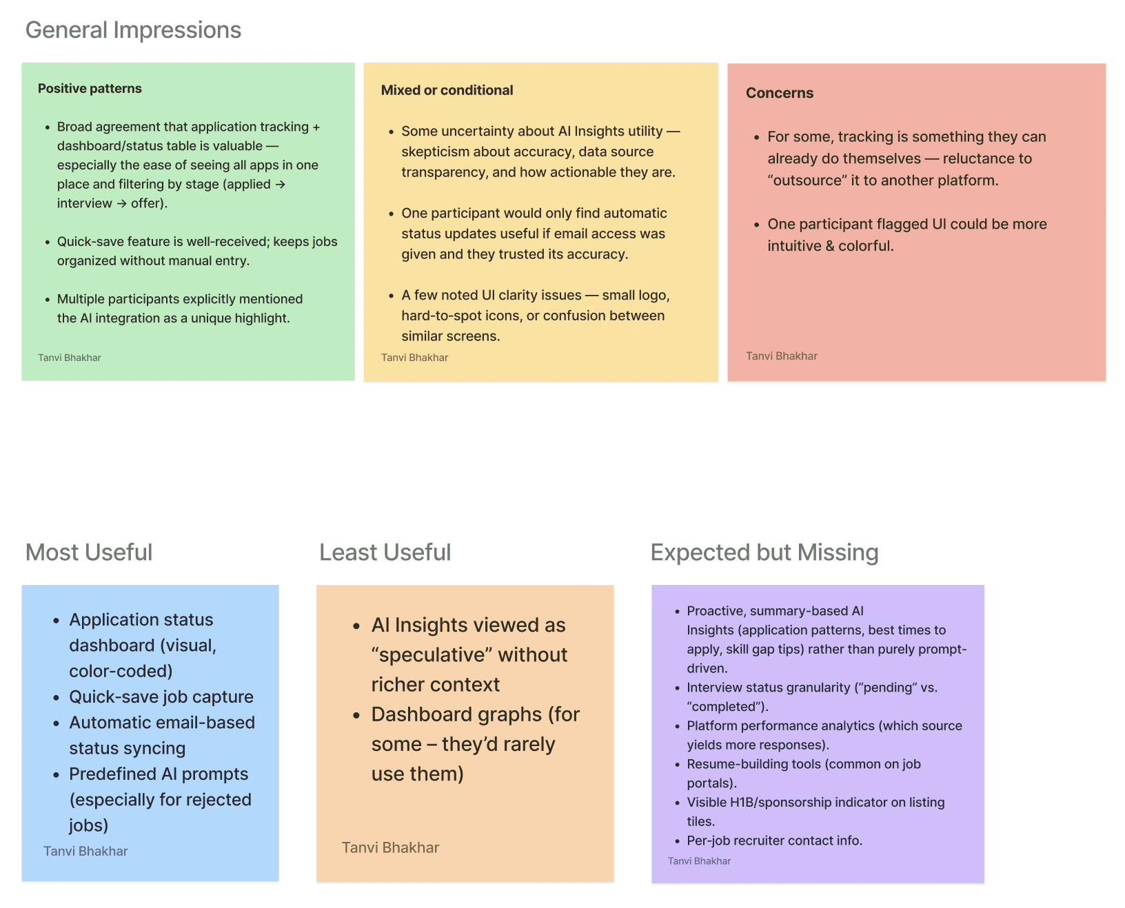
Most Useful: Application status dashboard, quick-save job capture, automatic email-based status syncing, predefined AI prompts for rejected jobs. Least Useful: AI Insights viewed as "speculative" without richer context; dashboard graphs rarely consulted.
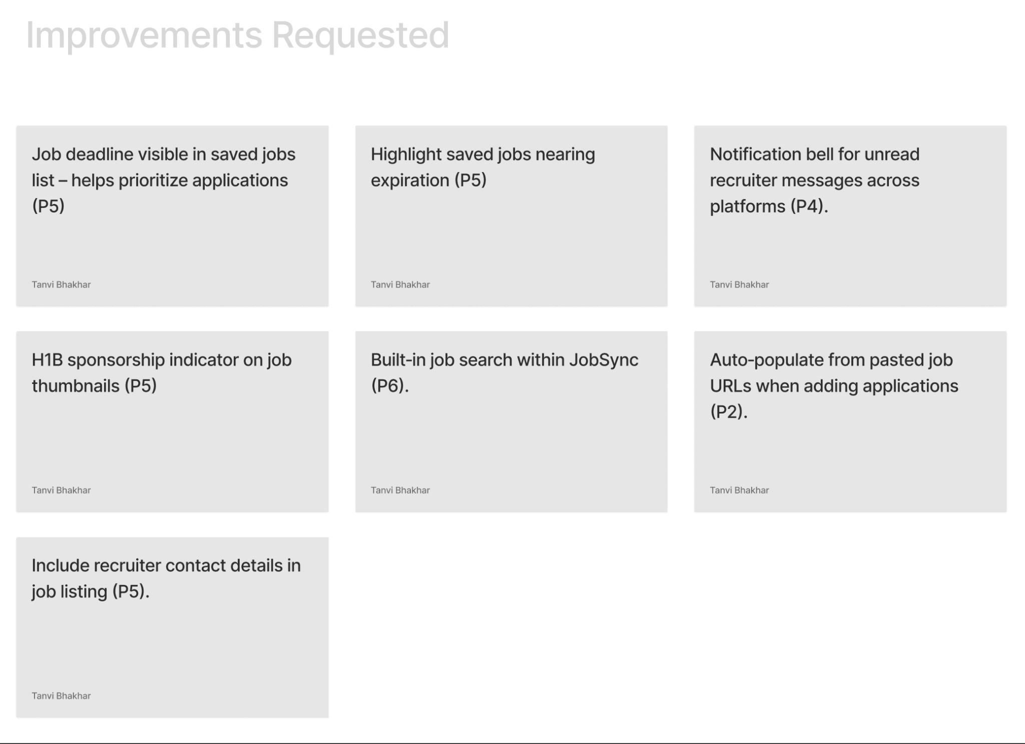
Improvements Requested
Beyond the core task issues, participants surfaced additional feature requests that now form our v2 roadmap.
Round 1 vs. Round 2 — Task Results
Task | Success R1 → R2 | Error Rate R1 → R2 | Avg. Time R1 → R2 | Key Change |
|---|---|---|---|---|
Onboarding | 100% → 100% | 42% → 0% | 3:35 → 2:39 | Step indicator added; condensed to 3 core screens; removed quick-tip overload |
Save a Job | 100% → 100% | 42% → 50% | 0:57 → 1:10 | Color + animation on save; removed redundant "Saved" page. State change still needs stronger affordance |
Update Status | 57% → 100% | 100% → 16% | 2:03 → 0:48 | Deleted parallel path; added direct status dropdown on tracker cards |
AI Insights | 86% → 83% | 43% → 50% | 2:38 → 1:26 | Rewrote prompts to be actionable; added expand/collapse. Preselection still creates friction |
"Users didn't fail from lack of effort. They failed because the interface didn't respect how people scan and navigate under cognitive load."
What Worked vs. What Needs Work
What Worked
Condensing onboarding. Deleting the parallel navigation path — removing a feature — proved more valuable than adding one. Rewriting AI copy from stats to actionable guidance changed perceived value without changing the model.
What Needs Work
Save-job confirmation is ambiguous — users complete it without registering it. AI insight navigation still requires preselection. Dashboard information hierarchy overwhelms users on first arrival post-onboarding.
Reflection & Future Work
What I will carry into every project after this;
01. Calm is a valid design goal to be considered
We kept asking "does this make the process calmer?" That turned out to be the right question. Anxiety reduction is as real an outcome as task completion rate.
02. The worst friction is between screens
The moments users got stuck weren't on any single screen — they were in the gaps between states the design hadn't thought to address.
03. How AI speaks matters more than what it knows
We didn't change the AI. We changed the prompts users commonly used. That alone shifted how users felt about the entire product.
04. Removing something can be the right call
Deleting the "Saved Applications" page and the parallel navigation path did more good than any new feature we could have added.
05. Watch people, don't just ask them
Completion rates told us what was broken. Sitting with users and watching them struggle told us why. You need both.
06. Design where the emotional low points are
The journey map showed mood dropping at "Wait & Respond." We designed most of our AI features for exactly that moment.
If JobSync had a v2, here's where I'd start
Fix the save confirmation
Users complete the save action without realizing it. It needs a toast notification and an extension icon badge — something persistent enough to register.
Make AI insights directly accessible
Right now, users have to preselect a job before the chatbot opens. Nobody expects that. Inline AI prompts on each job card would solve it.
Simplify the dashboard
Users feel overwhelmed after onboarding. We need to figure out what actually belongs above the fold — probably a card-sorting exercise with real users.
Make the AI proactive, not reactive
"You haven't heard back from 3 applications in 10 days. Want to send a follow-up?" That's the product users actually asked for. We haven't built it yet.

