Where
I
think
out
loud
about
design,
AI
&
everything
in
between.
Process writeups, AI experiments, hackathon recaps, UI explorations, events I attend, things I learn, and the occasional opinion I can't keep to myself. This is where my UX journey lives — unfiltered.

JobSync: Designing an AI-Powered, Privacy-First Job Search Experience
Figma
Miro/FigJam
JobSync is a conceptual browser extension and dashboard designed to help job seekers manage their applications, follow-ups, and insights in one focused, privacy-conscious space. The project explored how thoughtful UX, supported by AI, can reduce cognitive load during the job search without overwhelming users or compromising trust.
This case study documents a 0→1 design process, from early assumptions and user research to iterative prototyping, usability testing, and refinement. The goal was not to introduce more automation, but to design clarity into a complex, emotionally charged workflow.

FairShare: Rethinking Shared Finance Through Social Design
Figma/Miro
Notion/Google Docs
FairShare is a social-fintech app that makes sharing money with friends simple, fair, and fun. It reimagines group expense management by blending Splitwise-style functionality with social and gamified interactions. Users can automatically split bills, save collectively for shared goals, send friendly reminders, and celebrate milestones — all while maintaining transparency and harmony in their relationships.

Chirp: Hyper-Local Social Platform for Connected Neighborhoods
Figma/Figjam
Miro
Chirp is a concept project addressing the lack of safe, relevant digital spaces for neighborhood communication. Research showed that existing platforms often feel noisy or unmoderated, discouraging trust and participation. We chose this problem to explore how UX could enable meaningful local engagement without overwhelming users. The solution focused on a lightweight, community-first platform that prioritizes relevance, safety, and user control. Through user interviews, focused use cases, and iterative prototyping with usability testing, we designed an experience that helps neighbors share updates, discover local information, and engage confidently within their community.
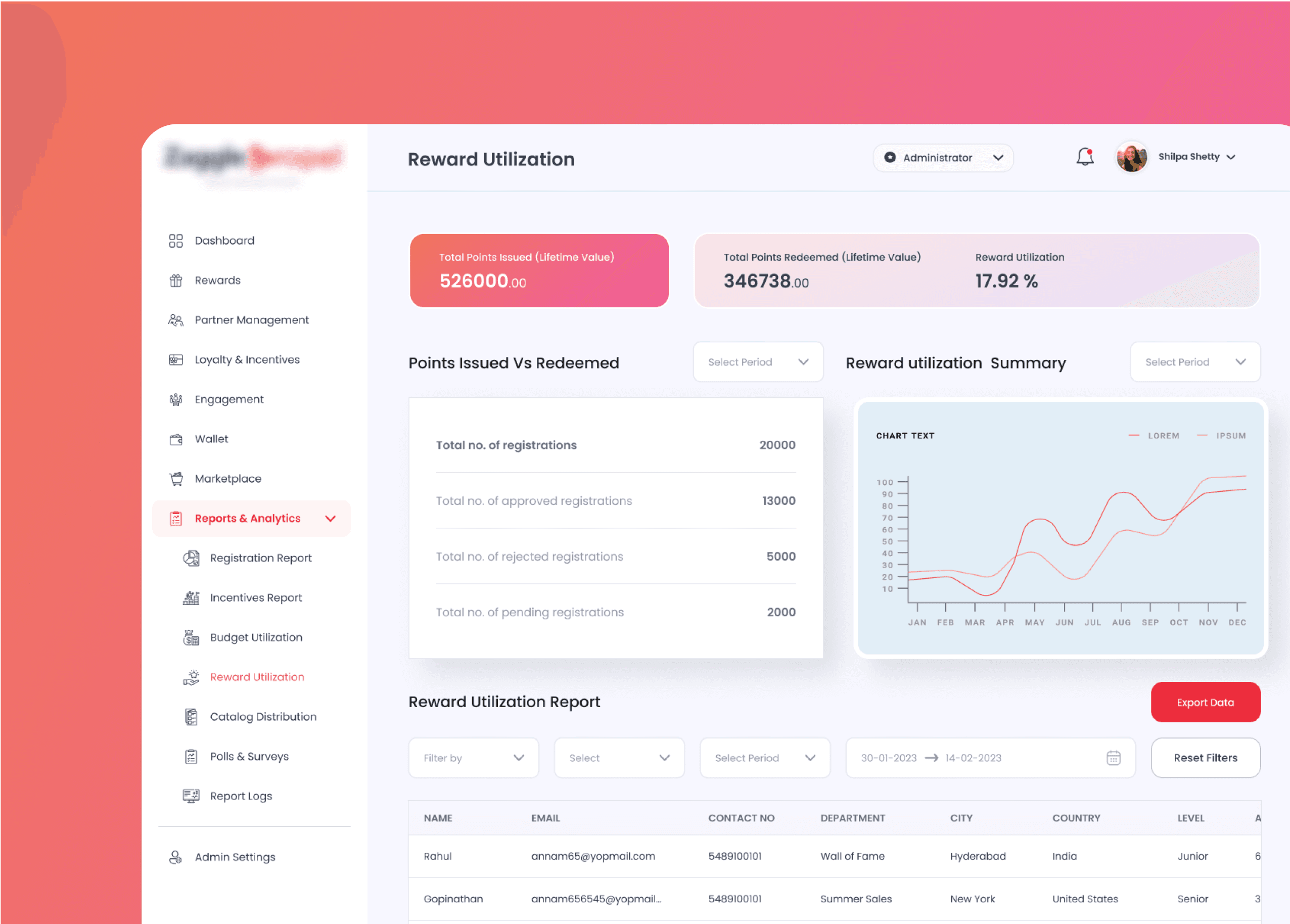
Zaggle: Elevating Employee Rewards & Recognition
SaaS
Gamification
Zaggle is a platform for employee rewards and recognition, designed to make peer recognition easy, engaging, and motivating—promoting a culture of appreciation and strengthening workplace connections.
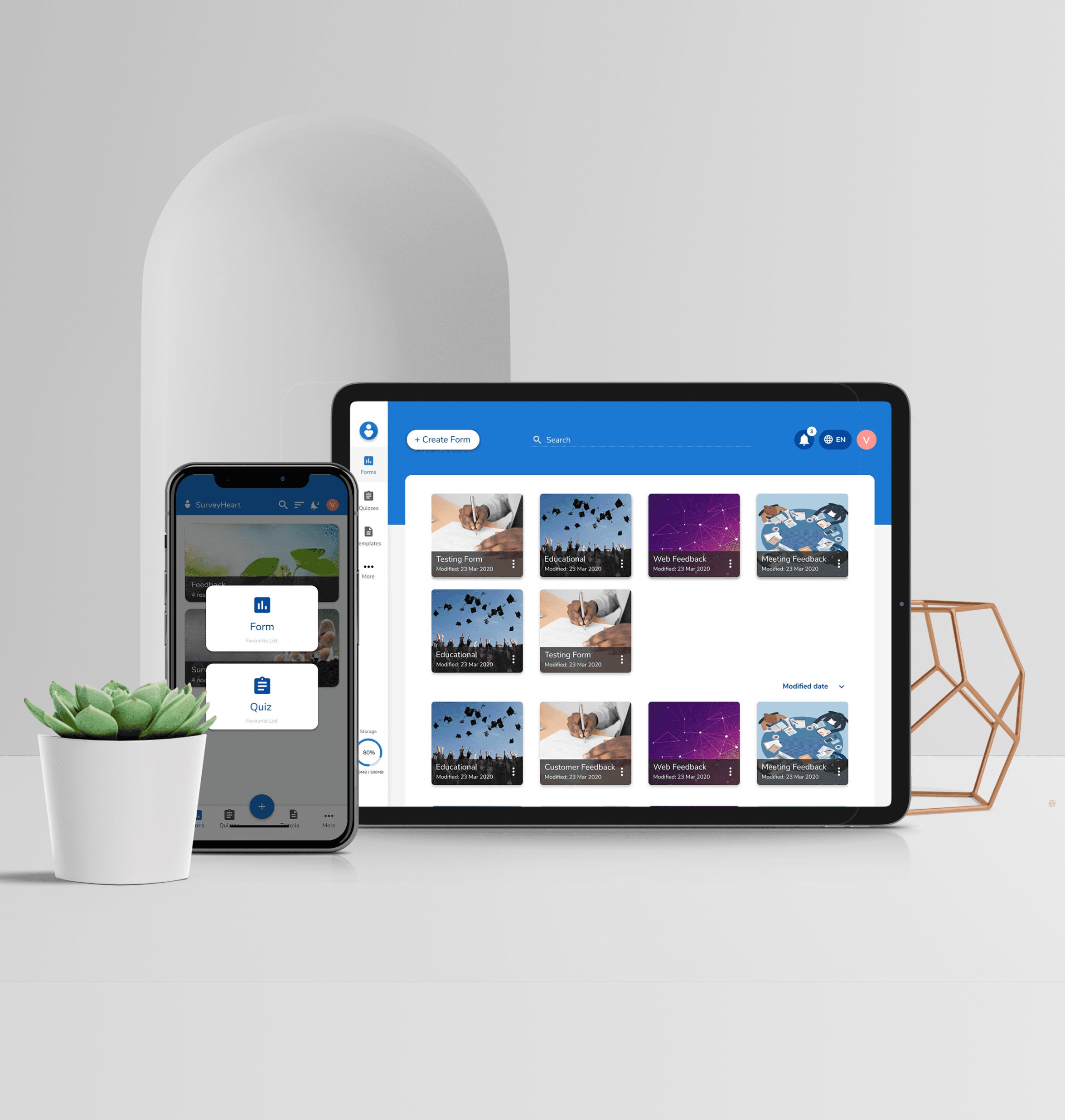
SurveyHeart: Enhancing the UX/UI for a Mobile & SaaS Form and Quiz Builder
SaaS
Design Systems
I redesigned a mobile and SaaS app for creating and managing forms and quizzes, delivering a seamless experience with modern design trends and efficient React.js components.

LoopWalk AI: Transforming everyday walks in the Chicago Loop into story-driven cultural discovery
Devpost
AI
Transforming everyday walks in the Chicago Loop into story-driven cultural discovery. The Chicago Loop is full of history, architecture, parks, cafés, and local businesses. It’s one of the most walkable and culturally rich areas in the city. But most people just pass through it. Navigation apps focus on getting you somewhere as quickly as possible. They calculate the fastest route, not the most meaningful one. LoopWalk AI adds a personalization layer to walking routes. Users first choose where they want to go or how long they want to walk. Then they describe how they want the walk to feel.

ShaikAI: How I Built a Portfolio Chatbot for Under $2/Month
Claude AI
Cloudflare Workers
No subscriptions. No backend experience. Just a designer figuring out how to make AI work on a Framer site — and documenting everything that went wrong along the way.

The Cognitive Load Conundrum: How to Keep Interfaces Intuitive
UX Research
Sep 16, 2024
Every interface asks users for attention, time, and trust. The silent agreement is simple: don’t make me work harder than I need to. Yet many products break this promise not through bad visuals, but by asking users to think too much.
Cognitive load is the mental effort required to use a product. When it’s high, users slow down, make mistakes, or quietly give up. They may not explain why, but they remember the frustration.
This is the cognitive load conundrum. Designers want powerful systems. Users want clarity. This post looks at what research tells us about balancing both and keeping interfaces intuitive without stripping them of depth.

Beyond Components: Creating Meaningful Design Systems
UI Design
Nov 5, 2025
Most design systems start with good intentions. Buttons. Colors. Typography. Spacing tokens neatly lined up like soldiers.
At some point, usually under delivery pressure, something subtle happens.
Components start multiplying. Variants get detached. Overrides sneak in. Someone duplicates a button because “it was faster.”
And suddenly, the system isn’t a system anymore.
It’s a very expensive pile of UI decisions.
And yet… many of them fail.
Not because the components are bad, but because meaning never made it into the system.
This article is about moving beyond components and building design systems that actually think, scale, and age well.
A design system is not a sticker pack. It’s a shared language.
JobSync: Designing an AI-Powered, Privacy-First Job Search Experience
Figma
Miro/FigJam
JobSync is a conceptual browser extension and dashboard designed to help job seekers manage their applications, follow-ups, and insights in one focused, privacy-conscious space. The project explored how thoughtful UX, supported by AI, can reduce cognitive load during the job search without overwhelming users or compromising trust.
This case study documents a 0→1 design process, from early assumptions and user research to iterative prototyping, usability testing, and refinement. The goal was not to introduce more automation, but to design clarity into a complex, emotionally charged workflow.
FairShare: Rethinking Shared Finance Through Social Design
Figma/Miro
Notion/Google Docs
FairShare is a social-fintech app that makes sharing money with friends simple, fair, and fun. It reimagines group expense management by blending Splitwise-style functionality with social and gamified interactions. Users can automatically split bills, save collectively for shared goals, send friendly reminders, and celebrate milestones — all while maintaining transparency and harmony in their relationships.
Chirp: Hyper-Local Social Platform for Connected Neighborhoods
Figma/Figjam
Miro
Chirp is a concept project addressing the lack of safe, relevant digital spaces for neighborhood communication. Research showed that existing platforms often feel noisy or unmoderated, discouraging trust and participation. We chose this problem to explore how UX could enable meaningful local engagement without overwhelming users. The solution focused on a lightweight, community-first platform that prioritizes relevance, safety, and user control. Through user interviews, focused use cases, and iterative prototyping with usability testing, we designed an experience that helps neighbors share updates, discover local information, and engage confidently within their community.
Zaggle: Elevating Employee Rewards & Recognition
SaaS
Gamification
Zaggle is a platform for employee rewards and recognition, designed to make peer recognition easy, engaging, and motivating—promoting a culture of appreciation and strengthening workplace connections.
SurveyHeart: Enhancing the UX/UI for a Mobile & SaaS Form and Quiz Builder
SaaS
Design Systems
I redesigned a mobile and SaaS app for creating and managing forms and quizzes, delivering a seamless experience with modern design trends and efficient React.js components.
LoopWalk AI: Transforming everyday walks in the Chicago Loop into story-driven cultural discovery
Devpost
AI
Transforming everyday walks in the Chicago Loop into story-driven cultural discovery. The Chicago Loop is full of history, architecture, parks, cafés, and local businesses. It’s one of the most walkable and culturally rich areas in the city. But most people just pass through it. Navigation apps focus on getting you somewhere as quickly as possible. They calculate the fastest route, not the most meaningful one. LoopWalk AI adds a personalization layer to walking routes. Users first choose where they want to go or how long they want to walk. Then they describe how they want the walk to feel.
ShaikAI: How I Built a Portfolio Chatbot for Under $2/Month
Claude AI
Cloudflare Workers
No subscriptions. No backend experience. Just a designer figuring out how to make AI work on a Framer site — and documenting everything that went wrong along the way.
The Cognitive Load Conundrum: How to Keep Interfaces Intuitive
UX Research
Sep 16, 2024
Every interface asks users for attention, time, and trust. The silent agreement is simple: don’t make me work harder than I need to. Yet many products break this promise not through bad visuals, but by asking users to think too much.
Cognitive load is the mental effort required to use a product. When it’s high, users slow down, make mistakes, or quietly give up. They may not explain why, but they remember the frustration.
This is the cognitive load conundrum. Designers want powerful systems. Users want clarity. This post looks at what research tells us about balancing both and keeping interfaces intuitive without stripping them of depth.
Beyond Components: Creating Meaningful Design Systems
UI Design
Nov 5, 2025
Most design systems start with good intentions. Buttons. Colors. Typography. Spacing tokens neatly lined up like soldiers.
At some point, usually under delivery pressure, something subtle happens.
Components start multiplying. Variants get detached. Overrides sneak in. Someone duplicates a button because “it was faster.”
And suddenly, the system isn’t a system anymore.
It’s a very expensive pile of UI decisions.
And yet… many of them fail.
Not because the components are bad, but because meaning never made it into the system.
This article is about moving beyond components and building design systems that actually think, scale, and age well.
A design system is not a sticker pack. It’s a shared language.